Sign-in Experiment
Project Background
Project Details
Experiment: Revise messaging for creating sign-in credentials when a customer buys a Microsoft 365 subscription
Role: Content Designer
Company: Microsoft
Status: Experiment launched Sept 2023
content process
Conducted preliminary discussions with the product manager and engineer to understand the user problem
Dug into past research and help documentation
Collaborated multiple times with the UX designer and project manager and took content to weekly content crit for feedback
Applied Microsoft content coherence and accessibility guidelines
Insights
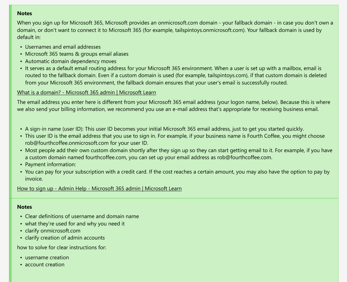
In my detective work, I uncovered that the term we used in the sign-up creation used a legacy term that was no longer accurate. This was a breakthrough moment in clarifying the messaging for this step in the flow.
Design problem
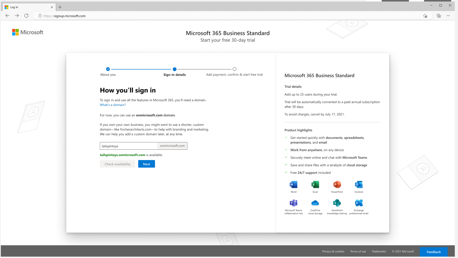
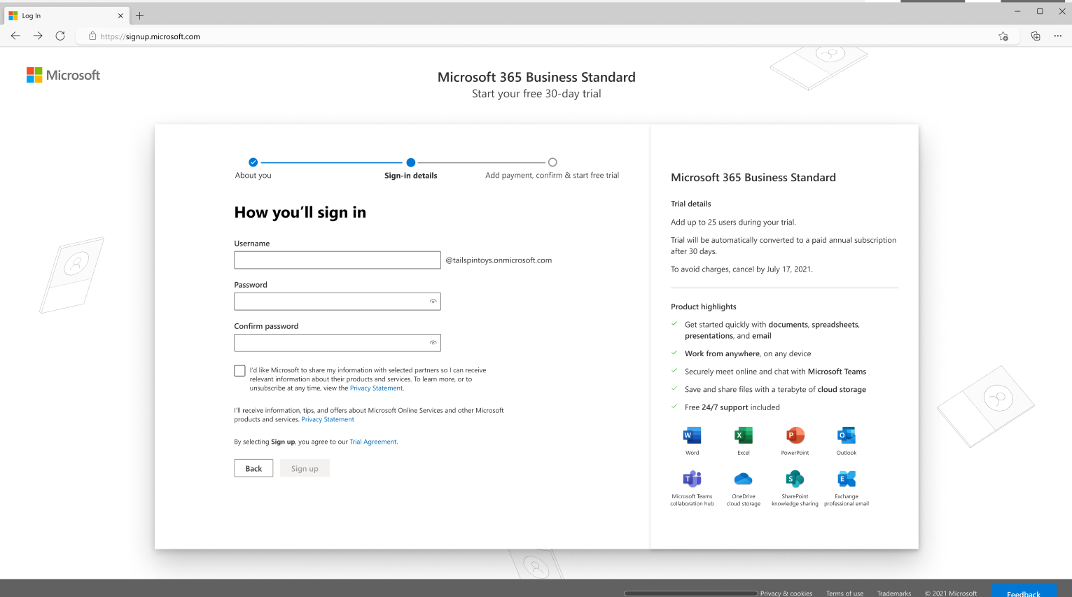
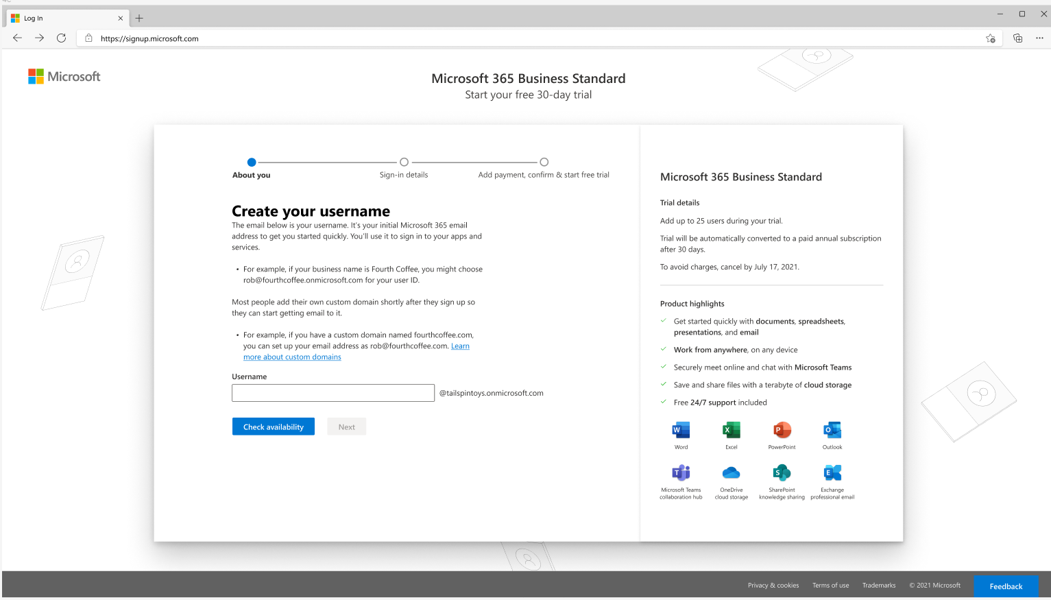
When customers buy a Microsoft 365 subscription (e.g., Microsoft 365 Business Standard), they step through a sign-up flow to create an account with Microsoft. One step involves creating a sign-in email they’ll use to sign in to Microsoft services and the Microsoft 365 admin center. During a team meeting to discuss a proposed experiment, the team questioned the term “username” and realized that we had our own confusion over what it meant. No one on the team knew the history of the term and its initial function.
Original username creation in two steps
Content Iterations
To begin the content process, I educated myself on the sign-in process by scouring the help documentation and past research studies. Then, I interviewed content designers who had worked on the initial sign-up and acquisition flow for Microsoft 365 business products. What I learned was that the existing UX design of the flow was inaccurate. Not only was the terminology inaccurate, but so was the UI design.
With this knowledge, I created a few mockups in Figma to recast the messaging and how the input fields were presented in the step. Then, I collaborated with the UX designer, who refined the design.
I took the revised messaging to a content critique for feedback from other content designers. I revised based on that feedback. Then, the UX designer and I presented our strongest version to the feature team.
Content iterations
final design
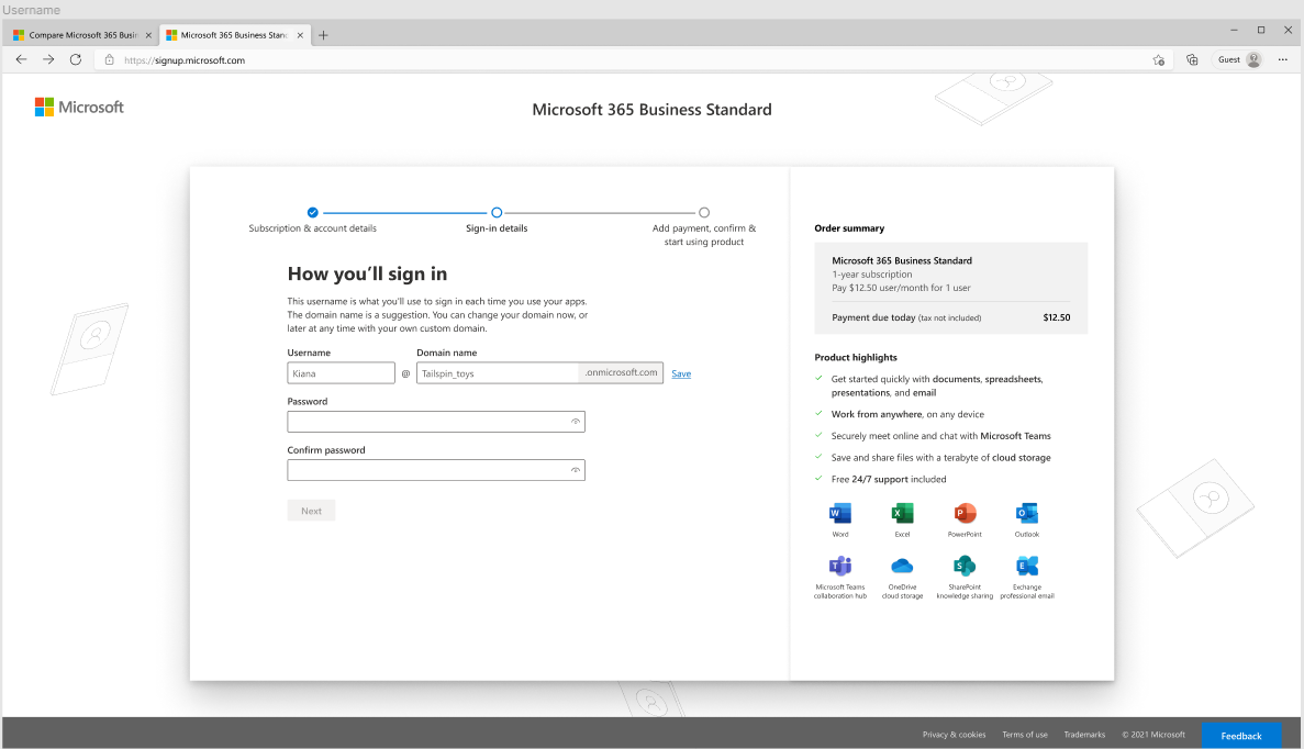
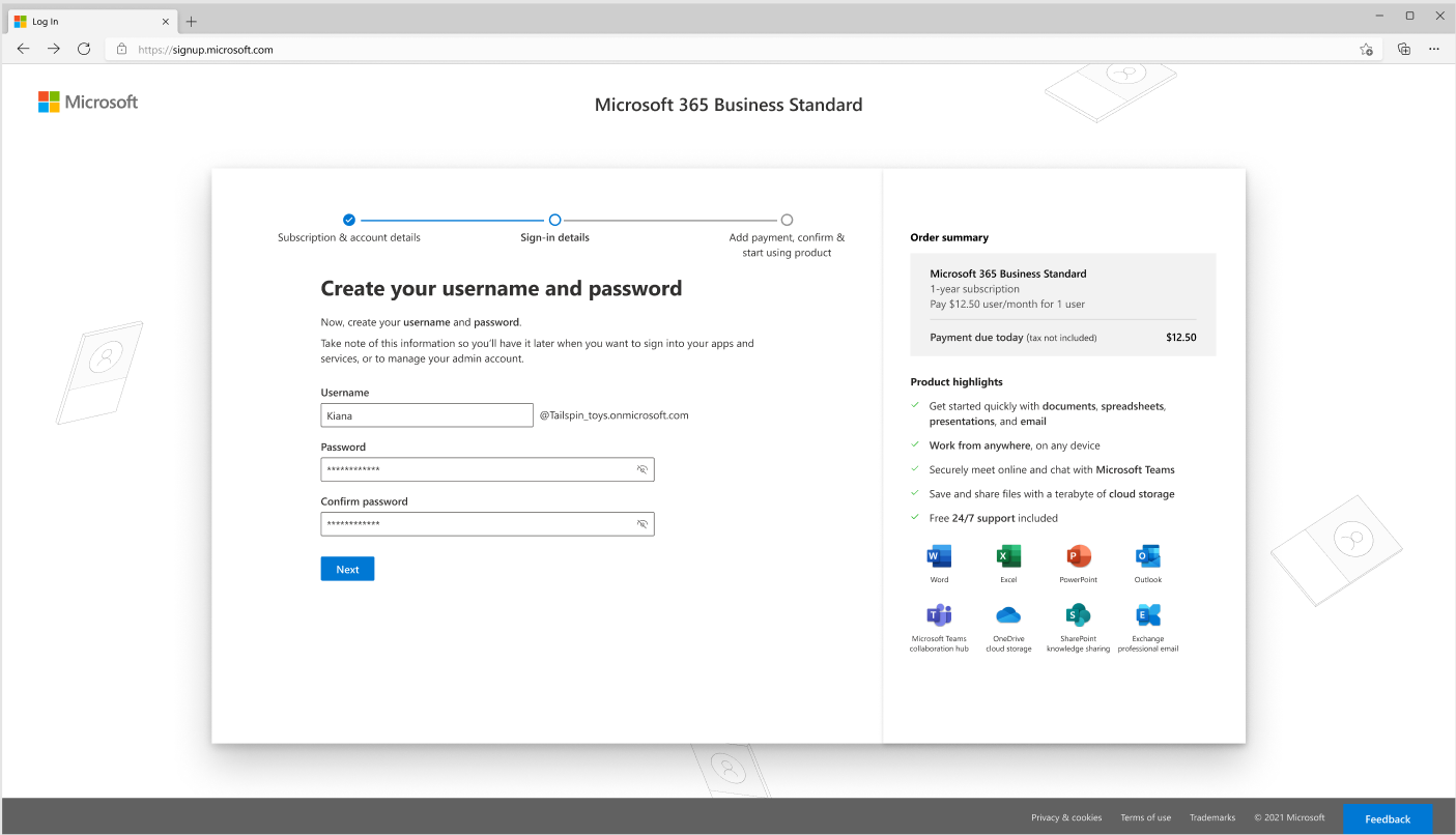
In the final design, I included:
a stronger and clearer header to focus on the action the customer takes in this step
clearer and more accurate messaging to clarify the customer is creating a sign-in email address
used a formula format to show how the username is combined with the domain name to create the sign-in email address
added clearer labels to the input fields to reinforce the formula idea
Insights
The key to clarifying the messaging for customers to create a sign-in email address was to find out the history of the UI step and uncover the legacy use of “username.” I couldn’t get rid of this term, but I could clearly call it out in the UI so that it makes sense to the customer.