Combined Sign-in
Project Background
Project Details
Phase 1: Simplify the sign-in experience for Medtronic MiniMed Diabetes.shop and CareLink Personal web platforms by combining sign-in flows into one username and password for both platforms.
Role: Content Designer
Company: Medtronic
Status: UX Design handed off to development December 2025
content process
Collaborated with CareLink UX Designers and CareLink Product Lead, Product Marketing Managers, Engineers and Diabetes.shop team to kick off the project and discuss requirements, project plan and timeline, and the various use cases.
Worked with the core UX team, including Product Lead, UX Designers, and UX researcher to brainstorm design user flows.
Engaged with Marketing Director to discuss overall content and communications and marketing strategy to ensure UX content was consistent and reinforced proper messaging across the ecosystem.
Drafted initial UX content to provide context about the new experience, providing the proper context for the experience, including benefits and setting expectations.
Iterated content based on core UX team feedback, larger team feedback, and user testing feedback.
deliverable
Figma design delivered end of December 2025. Launch pending.
Content DeSign problem
Medtronic MiniMed Diabetes.shop and CareLink Personal websites are built on separate platforms. Users have to two different sets of credentials to sign in to each platform. In most cases, users go long periods between signing in to the Diabetes.shop account. Older users have difficulty distinguishing between the two sites and can’t always remember their usernames and passwords. Other users don’t know that Diabetes.shop even exists. There is no unified experience between the two sites. The long-term plan is to create a more cohesive experience that easily connects one website to the next without creating friction or confusion for the user—the experience should be seamless and brand recognition should be the same across both sites and support future product additions to the ecosystem.
Phase 1 was to simplify sign-in for both sites so the user only had one username and password they could use to sign in to both sites, eliminating the need to memorize two sets of credentials.
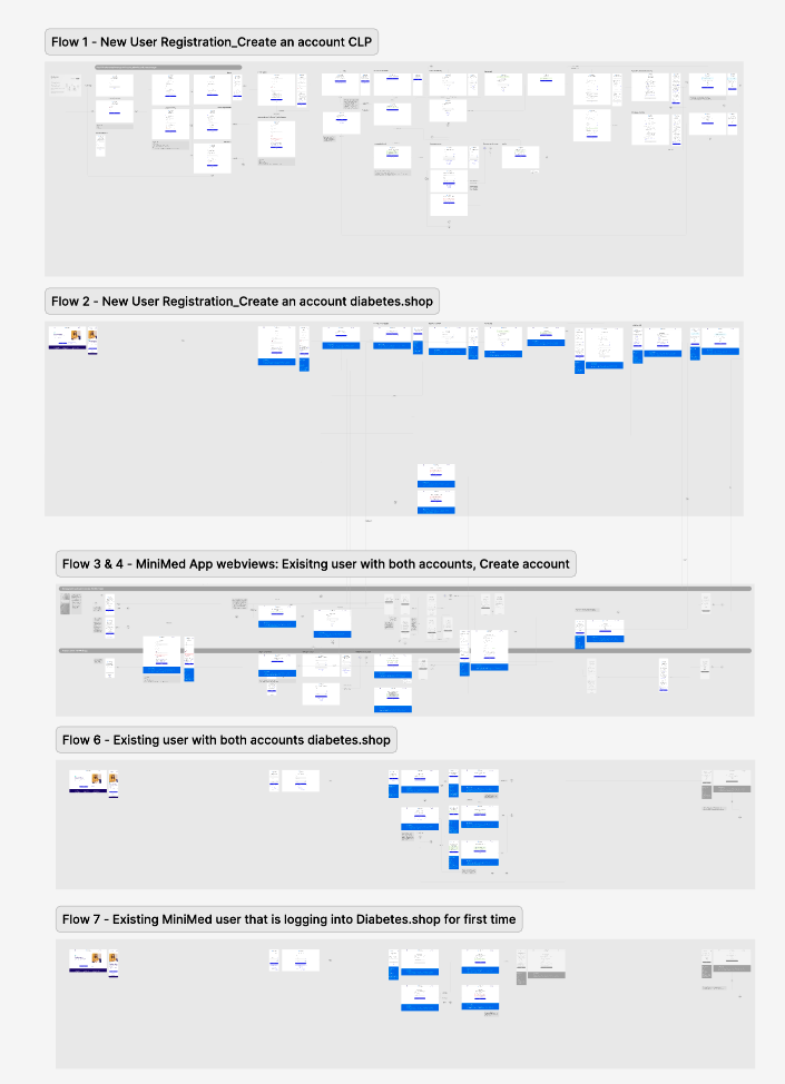
Content Iterations
My content process typically starts with collecting background research, outlining key questions, and meeting with subject‑matter experts. In this case, I connected with the Marketing Director to ask about the overall communication plan. He provided me with an initial communications strategy and rough draft of messaging.
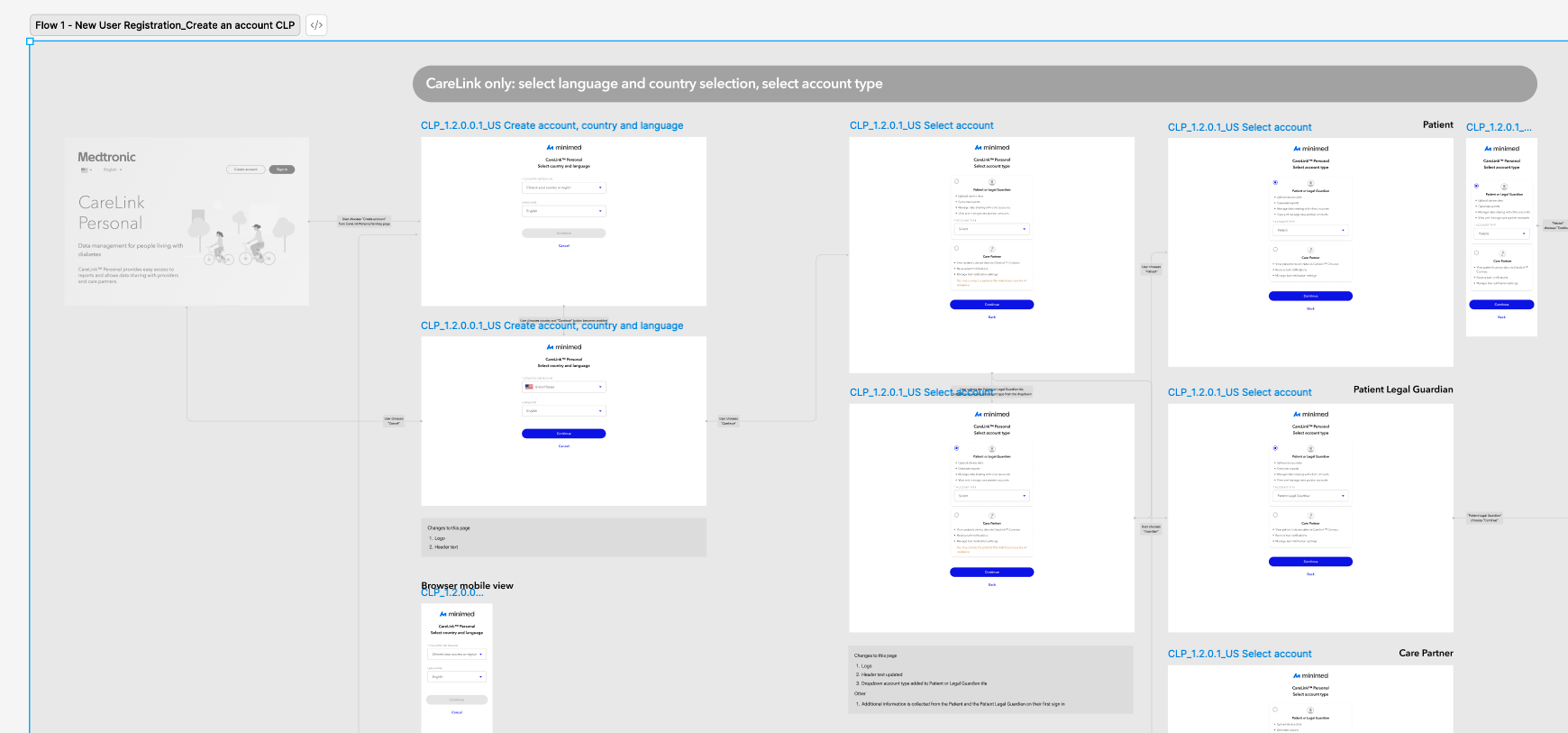
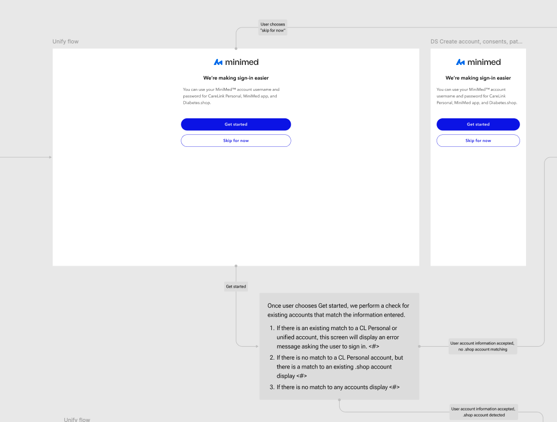
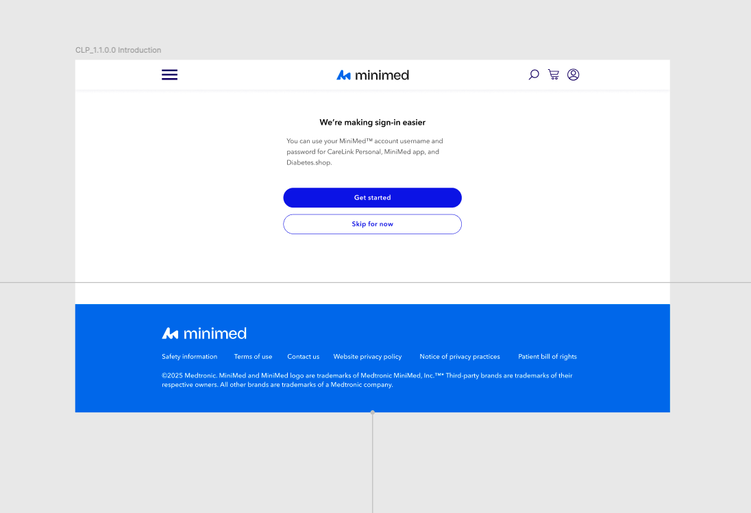
Intro screens
The key messaging for the combined sign‑in emphasized meeting users where they were and giving them the appropriate level of context. In my opinion, the user needed to understand what was happening and why. This message also had to be consistent across both the CareLink Personal and Diabetes.shop sites and the mobile app. We wanted the message to be consistent on both sites, but there were nuances around credential requirements and the Auth0 platform that we had to account for.
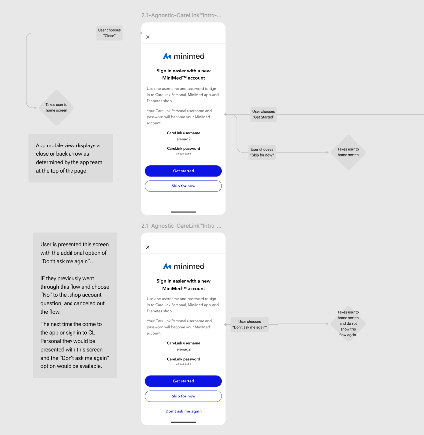
Mobile app intro screen
For the mobile app, I tailored the messaging for existing users. A push notification would lead them to a context-specific message, which varied from the web version to reflect the nuances of the mobile scenario.
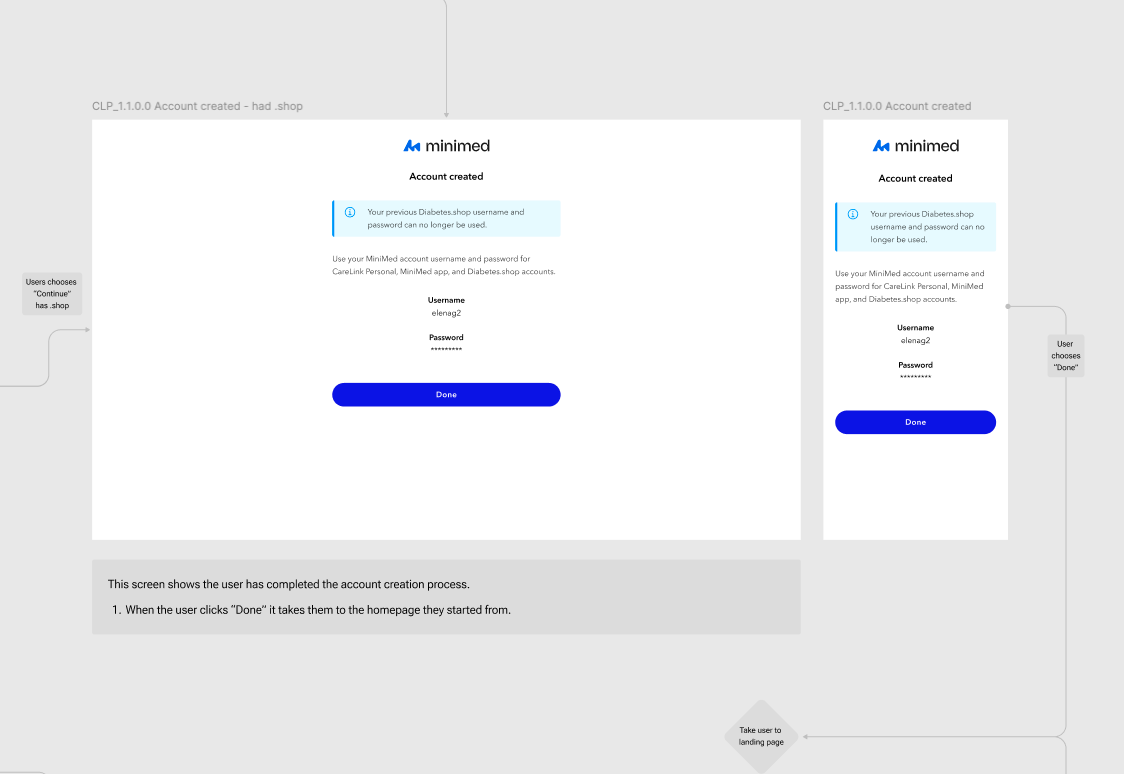
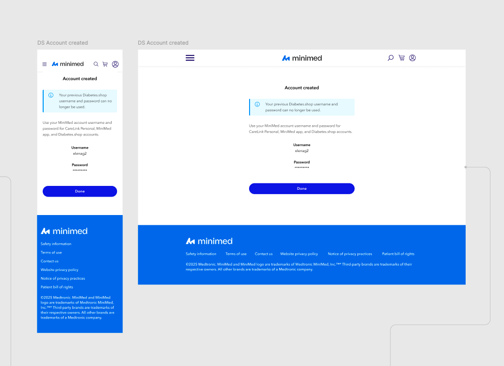
Confirm account created screens
This screen confirms that the user has successfully completed the flow and reassures them that they now have a single username and password for signing in across both sites, including the mobile app.
final design
After 6 months of design iteration that included two rounds of user testing and UX design and content polish, the final and approved Figma design was delivered to Engineering for development at the end of December 2025. Launch is pending.
Insights
Throughout the project—and through our twice‑weekly team meetings—the messaging evolved significantly. User testing played a key role in refining and focusing the content, while close collaboration helped surface questions and uncover technical constraints. Ultimately, the project was successful and genuinely rewarding to work through from a UX perspective.