Purchase Confirmation
Project Background
Project Details
Redesigning the confirmation page a customer sees after they buy a Microsoft 365 subscription to confirm the purchase, provide sign-in credentials, and information for where those credentials are used
Role: Content Designer
Company: Microsoft
Status: Shipped October 2022
content process
Conducted preliminary discussions with the product manager, engineer to understand the user problem
Reviewed competitor sites and read through past research studies and help documentation to gather necessary background info
Collaborated in multiple sessions with the UX designer and project manager
Took content iterations to content crits with other content designers
results
Calls to Customer Support were decreased
Design problem
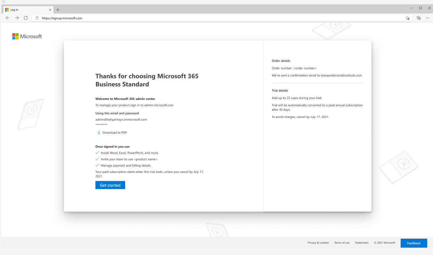
After customers buy a Microsoft 365 subscription (e.g., Microsoft 365 Business Standard), they immediately start using the product. When customers need to sign in to the Microsoft 365 admin center to manage their subscription, they don’t remember having created a sign-in email and password and can’t locate this information when they need it. This resulted in 600 to 700 support calls per month.
Original confirmation page
Content Iterations
After research and consultations with the product manager, I started multiple drafts to focus on the essential messaging, which needed to include the following:
confirmation of what the customer just bought
the email address they created in the sign-up flow that is used to sign in to the admin center
context for the admin center: what is it and what’s it for
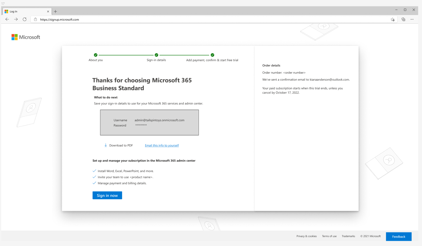
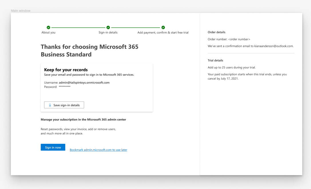
I created a couple of drafts in my Figma playground. Initially, the product team wanted to solve the customer problem with changing the messaging, so a UX designer was not assigned to the product. I brought a visual idea to my UX designer to highlight the sign-in email address information (see image 2 with the grey box below). He and I talked through my idea, and he came back with a more refined design (see image 3 below). Then I rewrote the content, applied Microsoft content coherence and accessibility guidelines. I took the draft to a content crit for feedback from other content designers, revised again based on that feedback and then reviewed the content with the product manager. I revised again and then presented the content to the feature team to get final sign-off.
Content iterations
final design
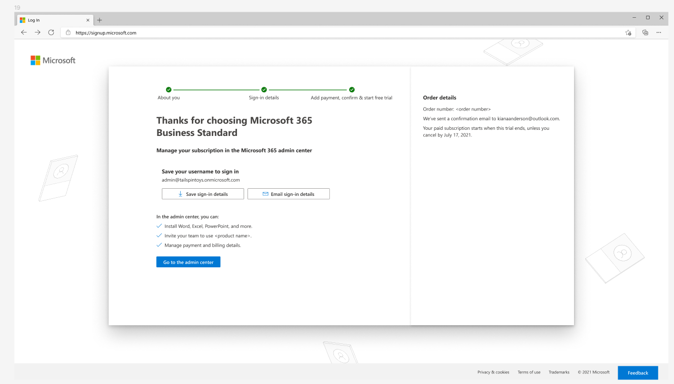
In the final design, I broke the content into sections with headers and clarity so the customer could scan the page and understand what information to focus on.
By putting the customer’s sign-in email in a box, we could highlight it with a Save button so the customer had an option to download it as a PDF. This was the visual idea I had collaborated with the UX designer on, and that the designer refined.
results
The final design resulted in the reduction in the number of support calls. Customers were now well informed about sign-in credentials and what they were for and had a method to save them for future use.